Bungie
Bungie — the studio behind Halo and Destiny — needed a rewards store that connected their in-game economy to a real-world e-commerce experience. I led design across the multi-sprint Magento 2 build, defining the Bungie-publisher pattern library, designing the in-game-credit redemption flow across the customer journey, and producing the 23-slide pre-order UX audit that drove the post-purchase redesign.
// Magento 2 Build Created @ Rightpoint
Imagine earning credits while gaming and seeing them waiting for you the moment you log into the store — every achievement, every reward, redeemable in one place.
The previous flow was tedious and broken across systems. I led design across 3 sprints to streamline it: linking each customer profile to their in-game identity through a series of API integrations, then surfacing earned credits at every stage of the funnel — dashboard, browsing, cart, post-purchase. The challenge wasn't building the integration. It was making it feel obvious.
Bungie Project Process
Challenge
Integrate In-Game Earnings with E-Comm
I designed a credit-display pattern that surfaced earned rewards at every step of the customer journey — the user dashboard, product detail pages, the cart, and the post-purchase confirmation. The goal was to make credits feel like part of the customer's identity, not a separate accounting system. Each surface used the same component, so as the catalog expanded, the integration scaled with it.
Solution
By integrating the login system used in the game with the e-commerce store, we were able to import user data achieved within the game. To provide a seamless and informative experience, this data needed to be displayed at all stages of the purchase funnel, including the user dashboard, throughout the purchase process, and in the post-purchase experience.
Challenge
Create a Design System
Bungie's main site is focused on their Destiny game brand, but they lacked a true branding system for the Bungie brand itself.
Solution
I anchored the system on neutral darks and a single Bungie accent so it would read as Bungie-the-publisher, not Destiny-the-game — which meant turning down some of the in-engine treatments the brand team had initially asked for. The pattern library was built in Magento Page Builder so the Bungie team could extend it without designer or dev support, and structured to absorb future game brands without rework.
Design
Pattern Library
A web UI pattern library is a collection of reusable design components that create consistent and coherent user interfaces. These libraries include things like buttons, forms, navigation menus, and other interface elements.
Design
Homepage
The design is based on the pattern library, which was designed and developed to be used with Magento Page Builder for optimal ongoing customization.

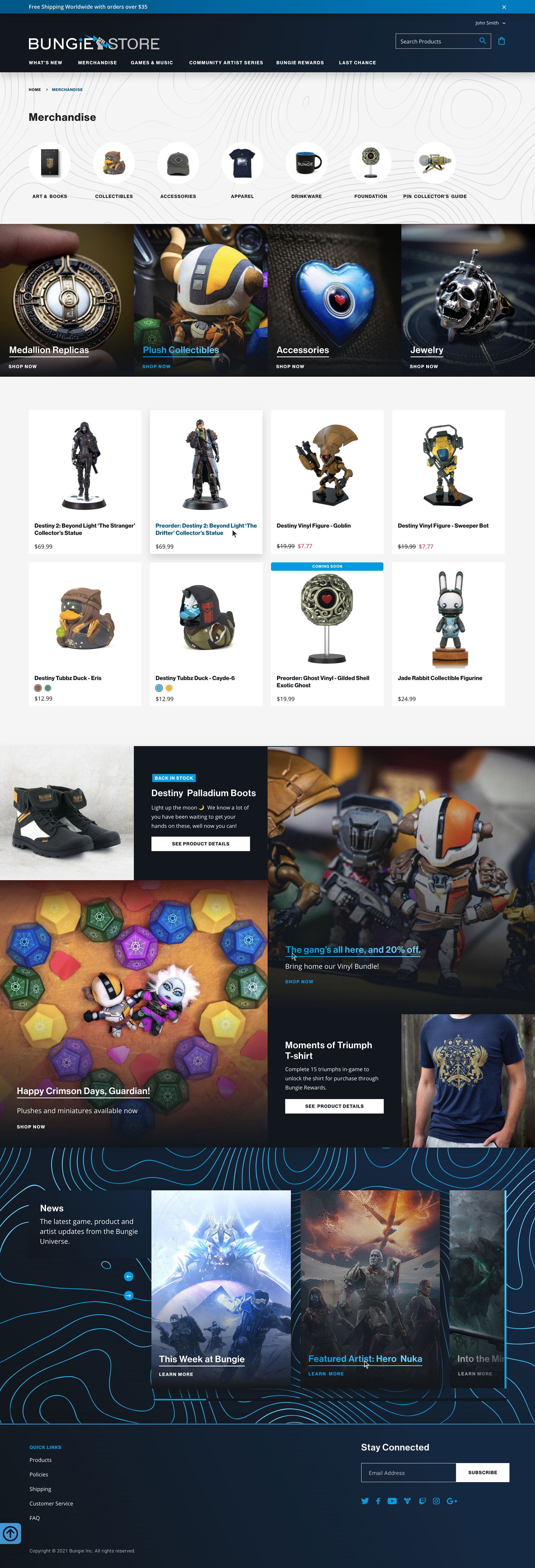
Banner Touts
Photography-led layouts (faster CMS updates, no baked text)
Live text for SEO and translation readiness Immersive crop using brand-recognizable game art
Subtle motion to draw the eye without slowing perceived load
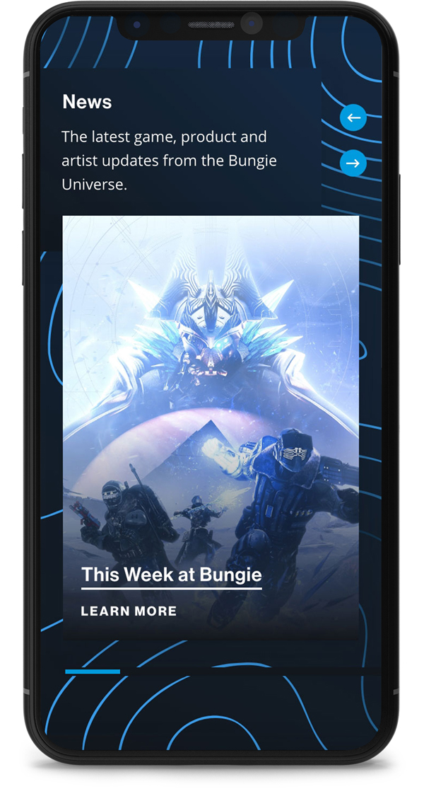
Media Slider
Brand-anchor moment for store visitors who don't know Bungie-the-publisher yet
Motion timed to scroll cues, not autoplay Accessible controls — keyboard navigable, ARIA-labeled, pause on hover
Edge-to-edge layout that doesn't compete with the in-game art it features
Design
Collection Landing Page
The design is based on the pattern library, which was designed and developed to be used with Magento Page Builder for optimal ongoing customization.

Collection Landing
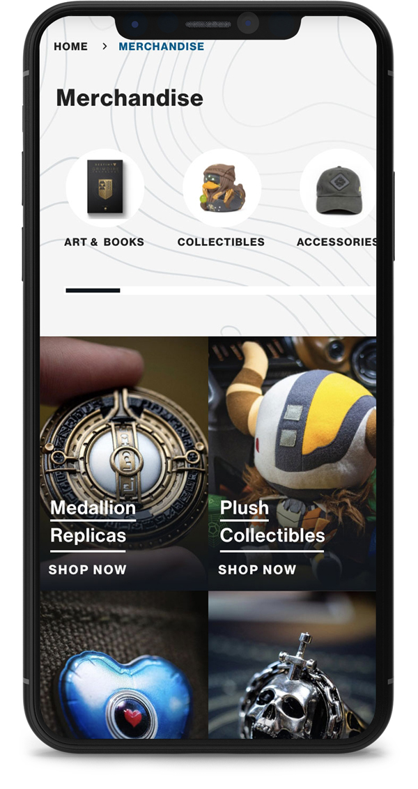
Secondary navigation surfacing the most-requested subcategories from analytics
Subcategory highlights driven by earned-rewards data, not just merchandising priorities
Mobile-first grid (the bulk of traffic was gamers mid-flow on phones)
Representative imagery sourced from Bungie's brand library — no stock
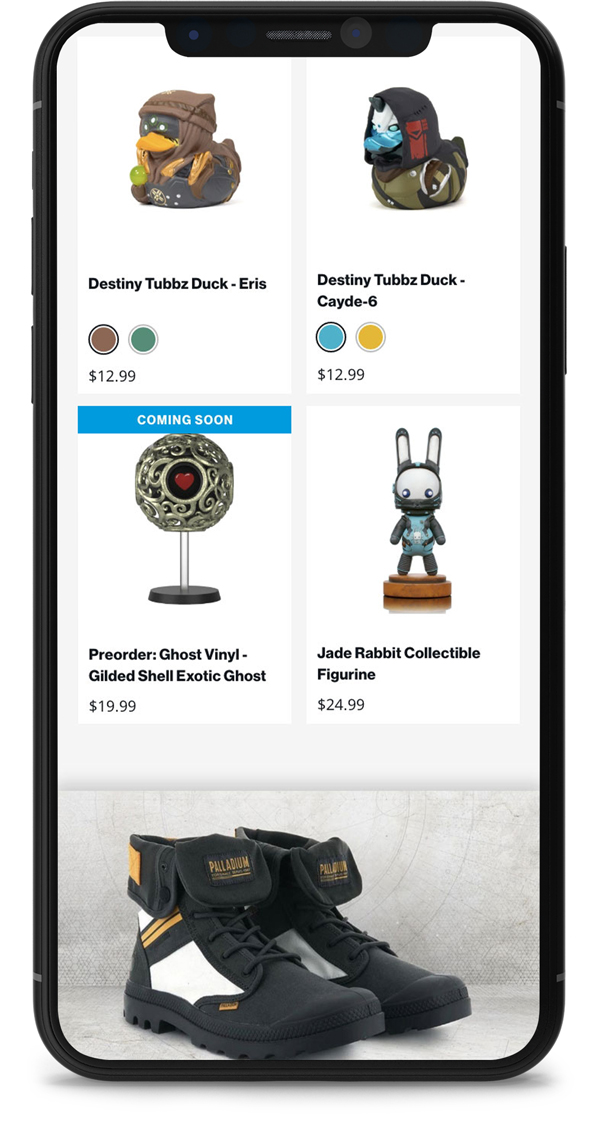
Listing Grid
Custom styling that read as Bungie-publisher, distinct from Destiny.com
Interactive swatches that updated the product image on hover (reduced PDP visits)
Custom badging — earned, available, locked — to set redemption expectations on the grid
Large imagery reserved for emotionally-charged products (limited drops, milestone rewards)
Design
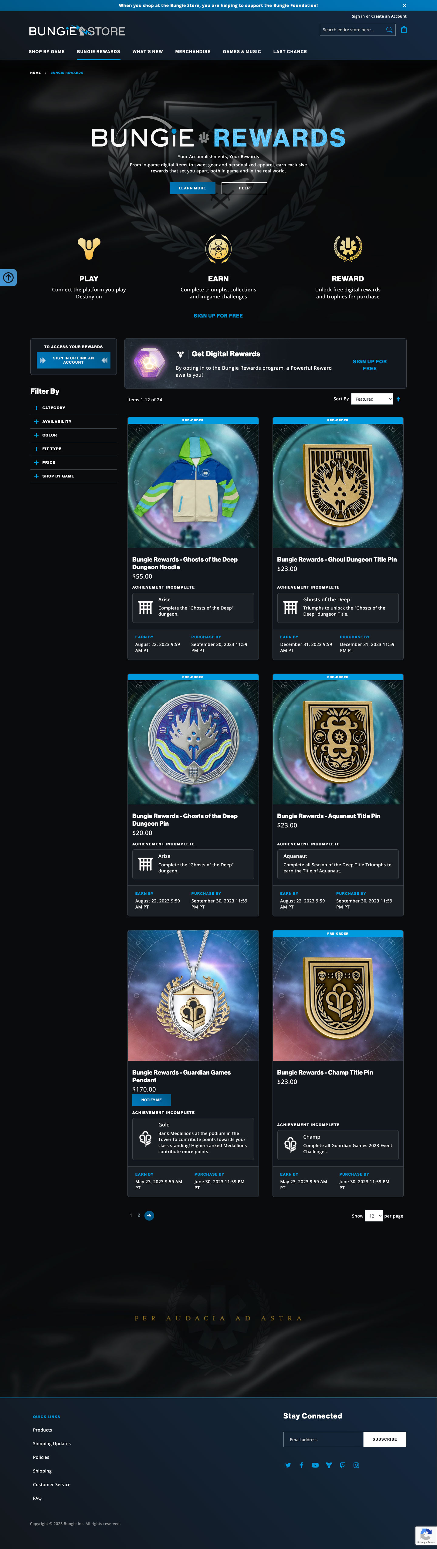
Rewards Landing Page
A customized page based on user data which displays current rewards and the user’s redemption status.


Challenge
Improve Pre Order Flow
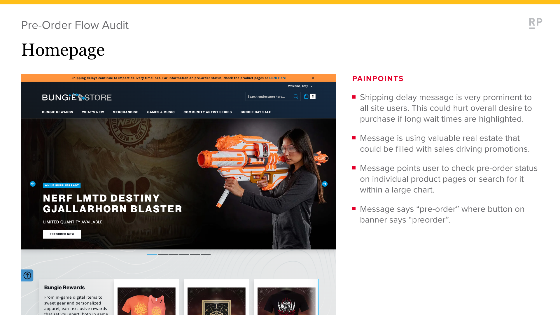
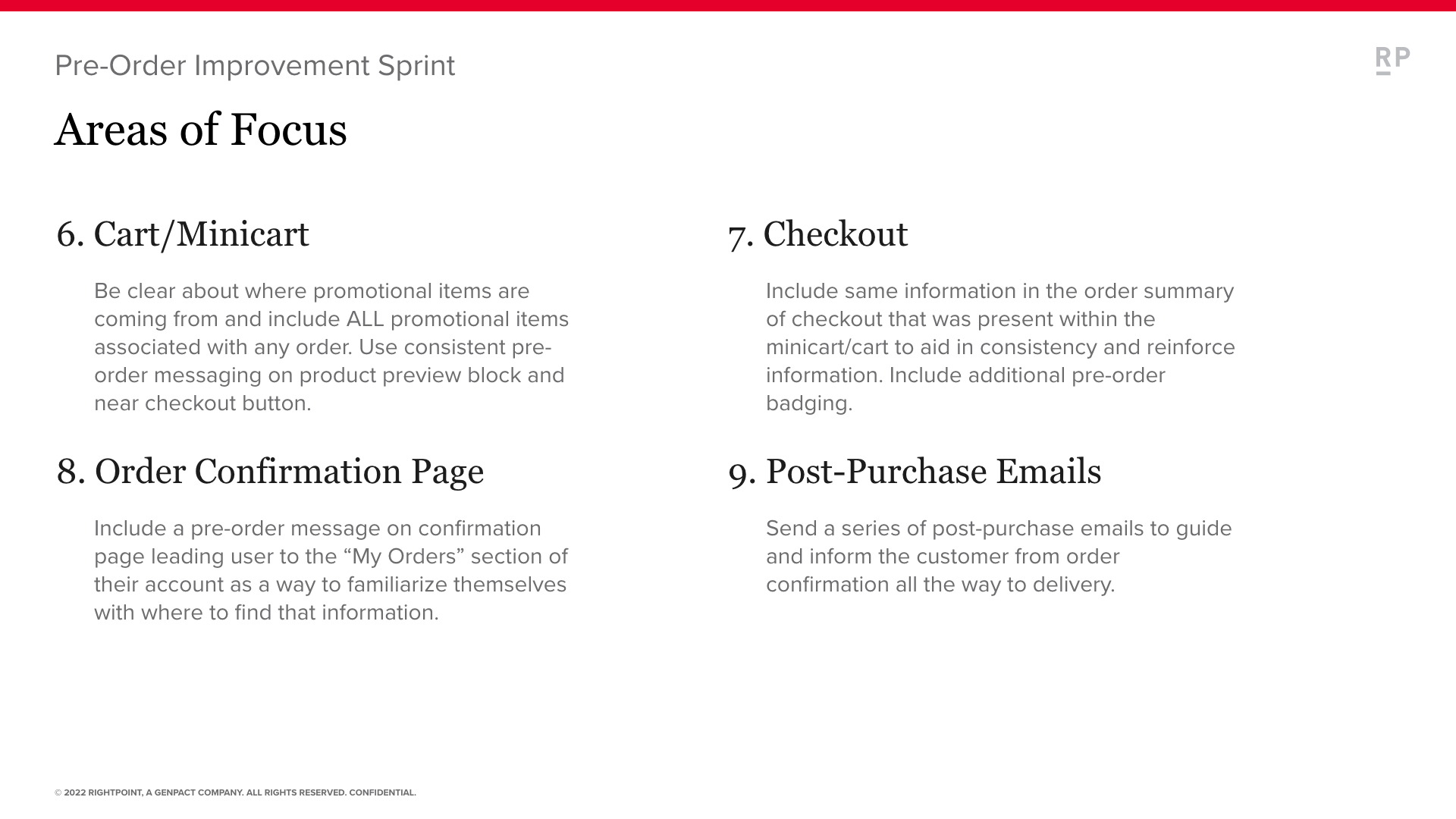
I audited the existing pre-order flow end-to-end — homepage messaging, PDP, cart, checkout, account, and the post-purchase email cadence — and turned the findings into a 23-slide deliverable: every existing state, every gap, and a phase-1 redesign. The new flow added countdown components, clearer order-status messaging, and an email cadence that matched the customer's mental model of waiting for a game drop, not tracking a normal package.
Solution
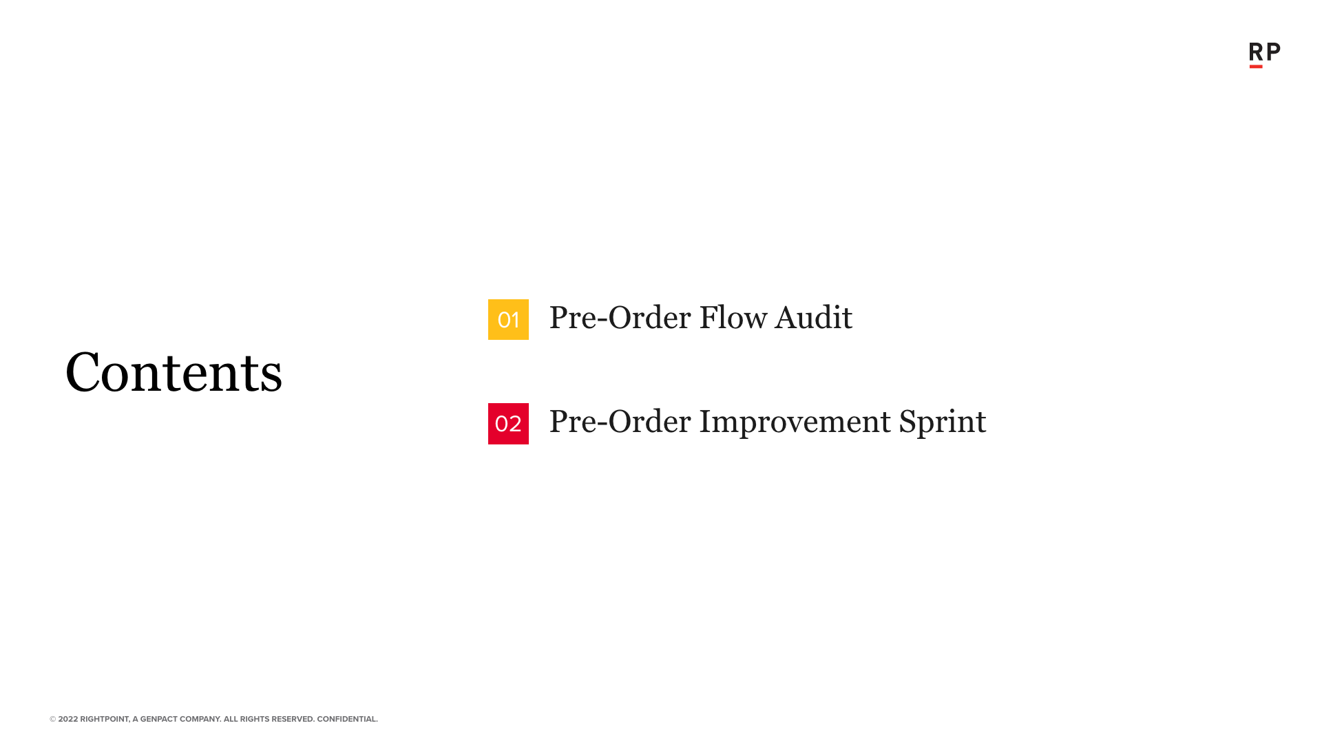
Thoroughly audit the existing flow process from start to finish. This audit examines each step in the process in order to identify any potential areas for improvement. Once the audit is complete, a set of recommendations can be made for how to improve the process to make it more efficient and effective.
Iterate
Pre Order UX Audit
Audit of the existing Pre Order experience and improvement strategy.


Design
Pre Order Re-Design
Suggested phase 1 improvements to Pre Order flow.
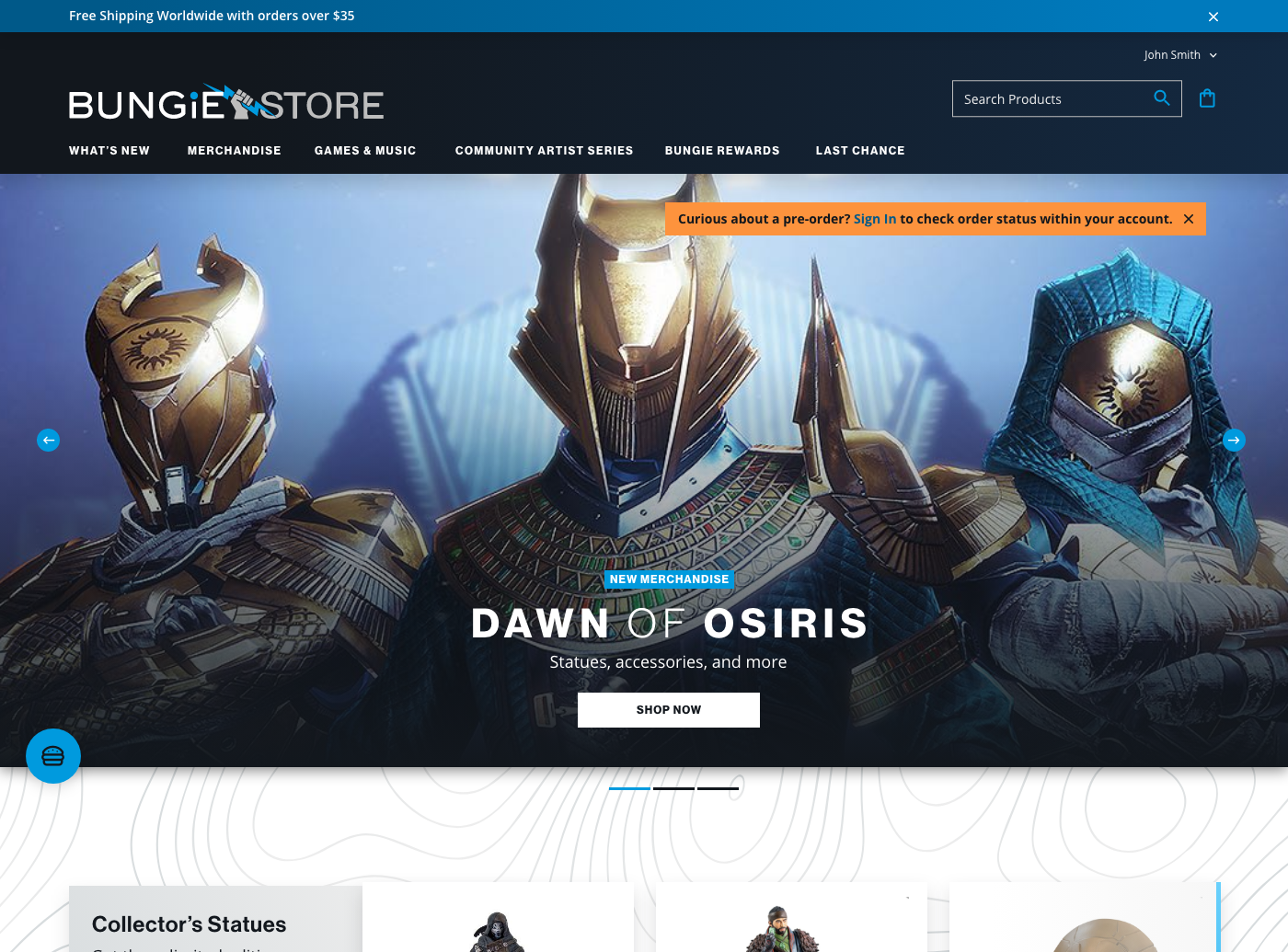
Homepage Pre Order Message

Pre Order - Product Listing Page

PDP Pre Order - Early Access
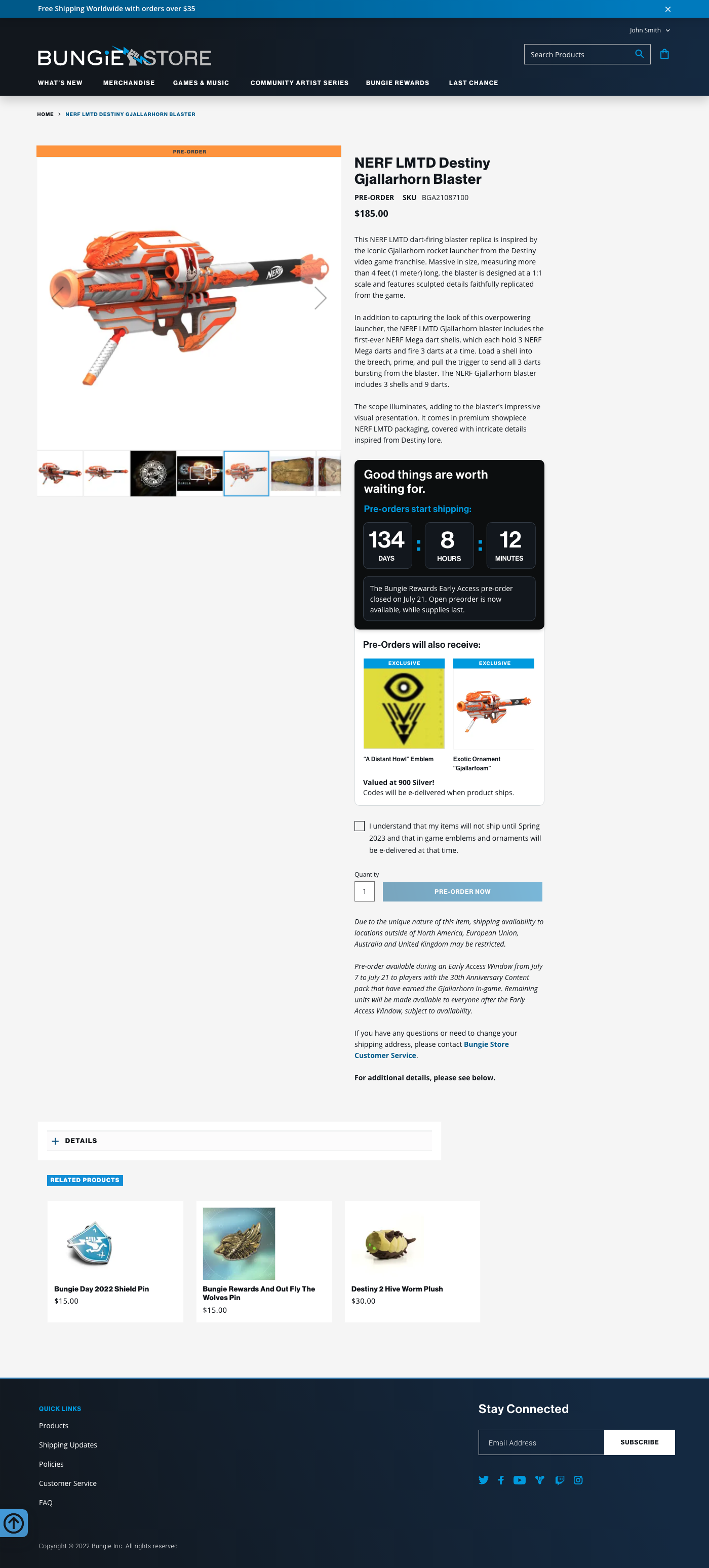
PDP Pre Order - Countdown

Minicart Pre Order - Message

Cart Pre Order - Message

Checkout Pre Order - Message

Checkout Pre Order - Order Confirmation

Account Page Pre Order - General Update
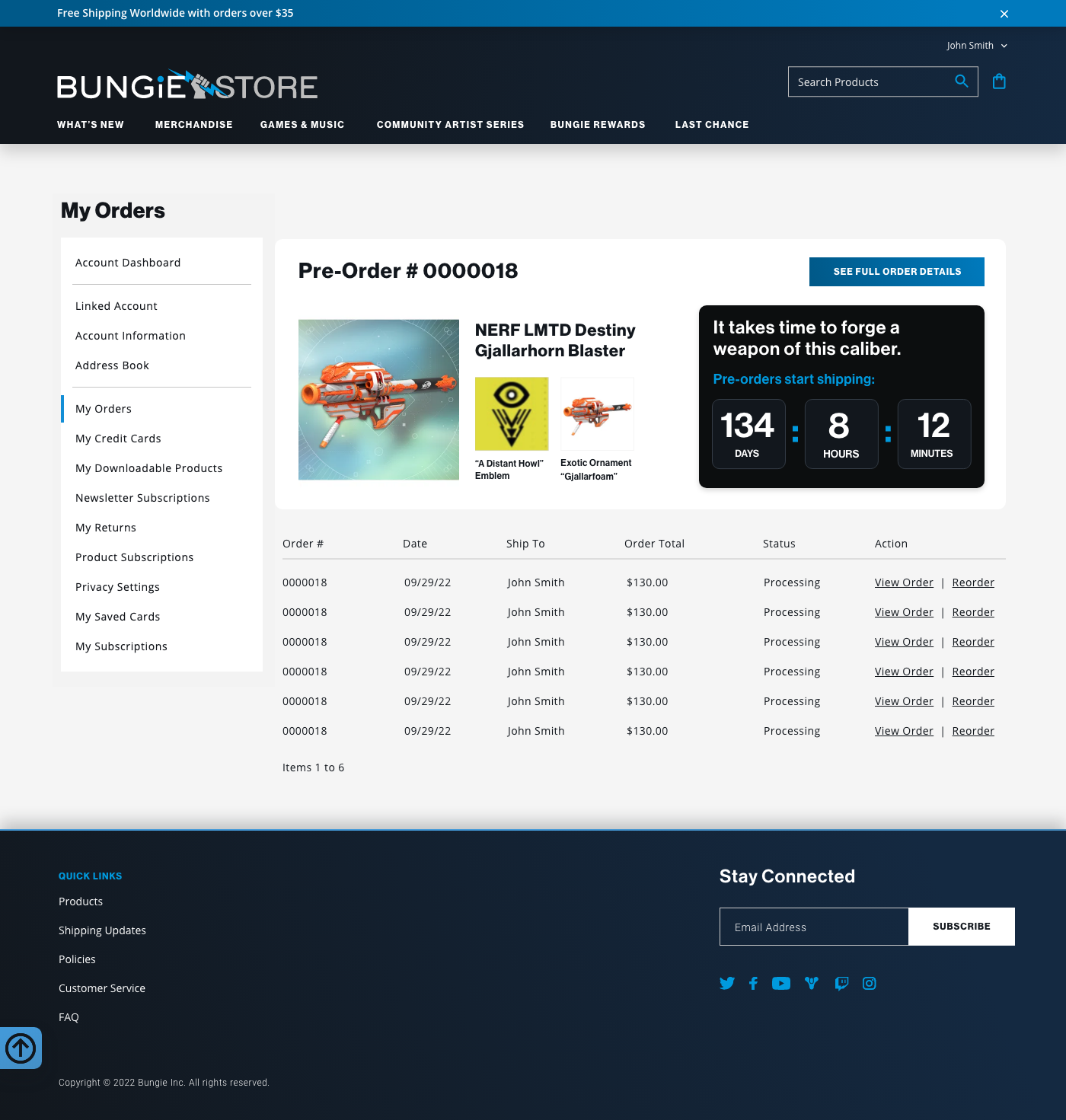
Account Page Pre Order - Countdown

Account Page Pre Order - Shipped
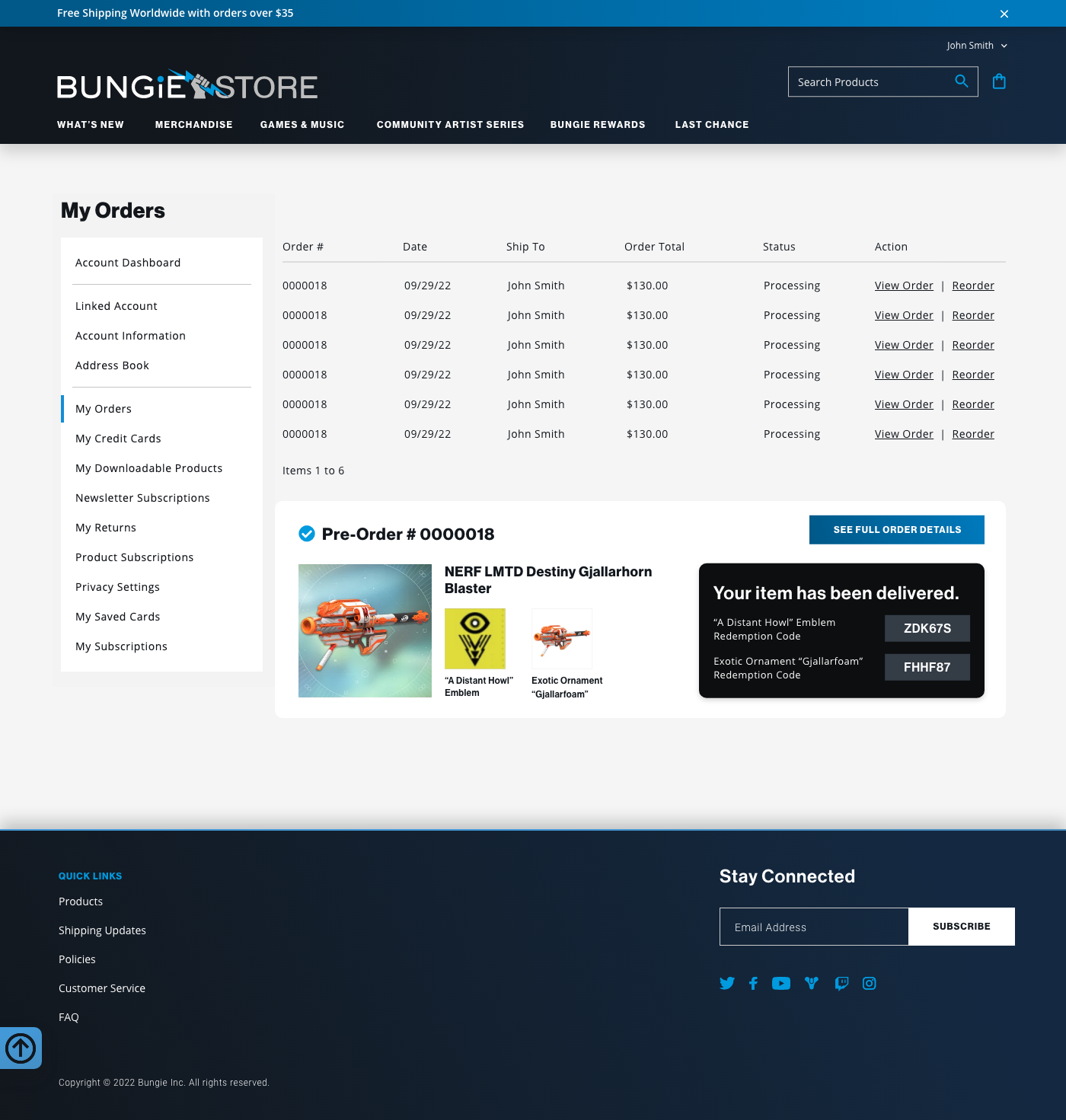
Account Page Pre Order - Delivered
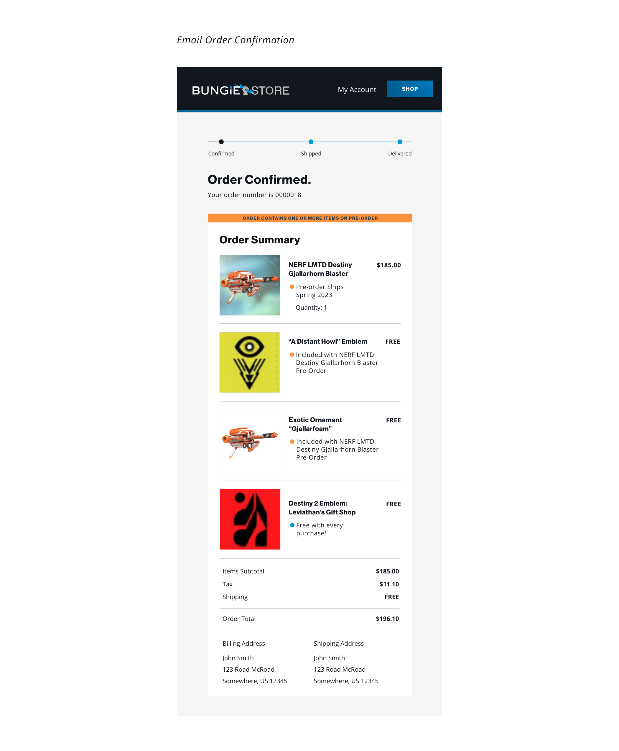
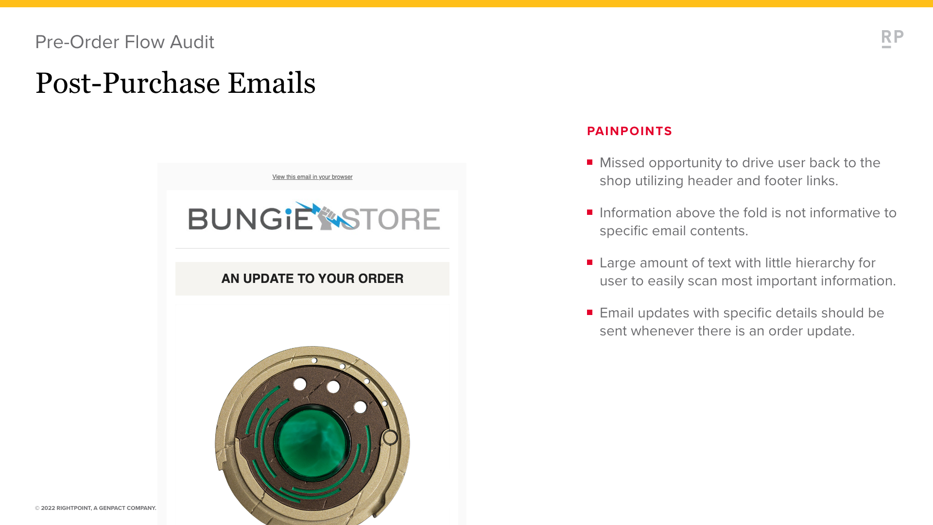
Email Pre Order - Order Confirmation

Email Pre Order - Timeline Update

Email Pre Order - Timeline Update
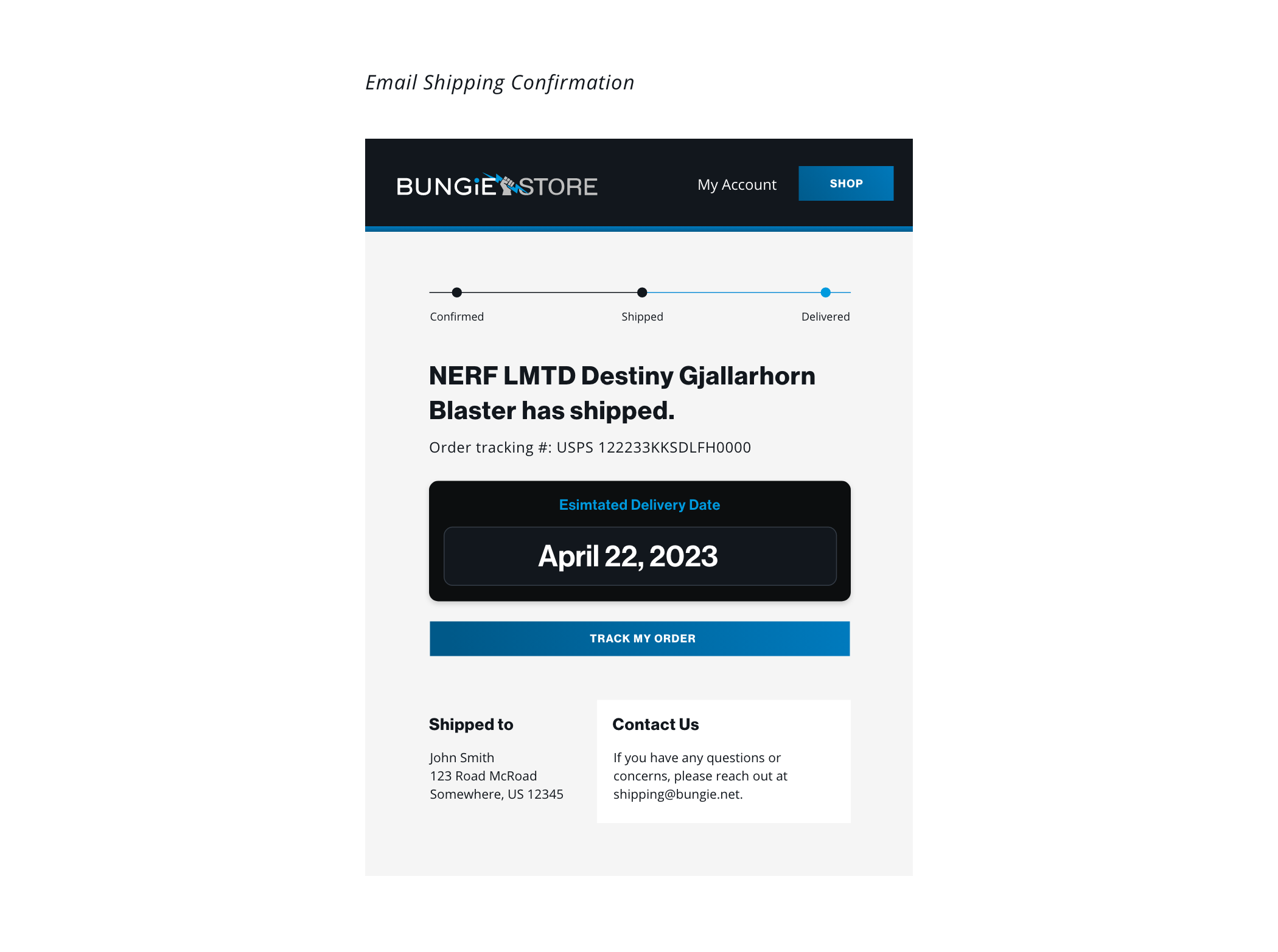
Email Pre Order - Shipping Confirmation
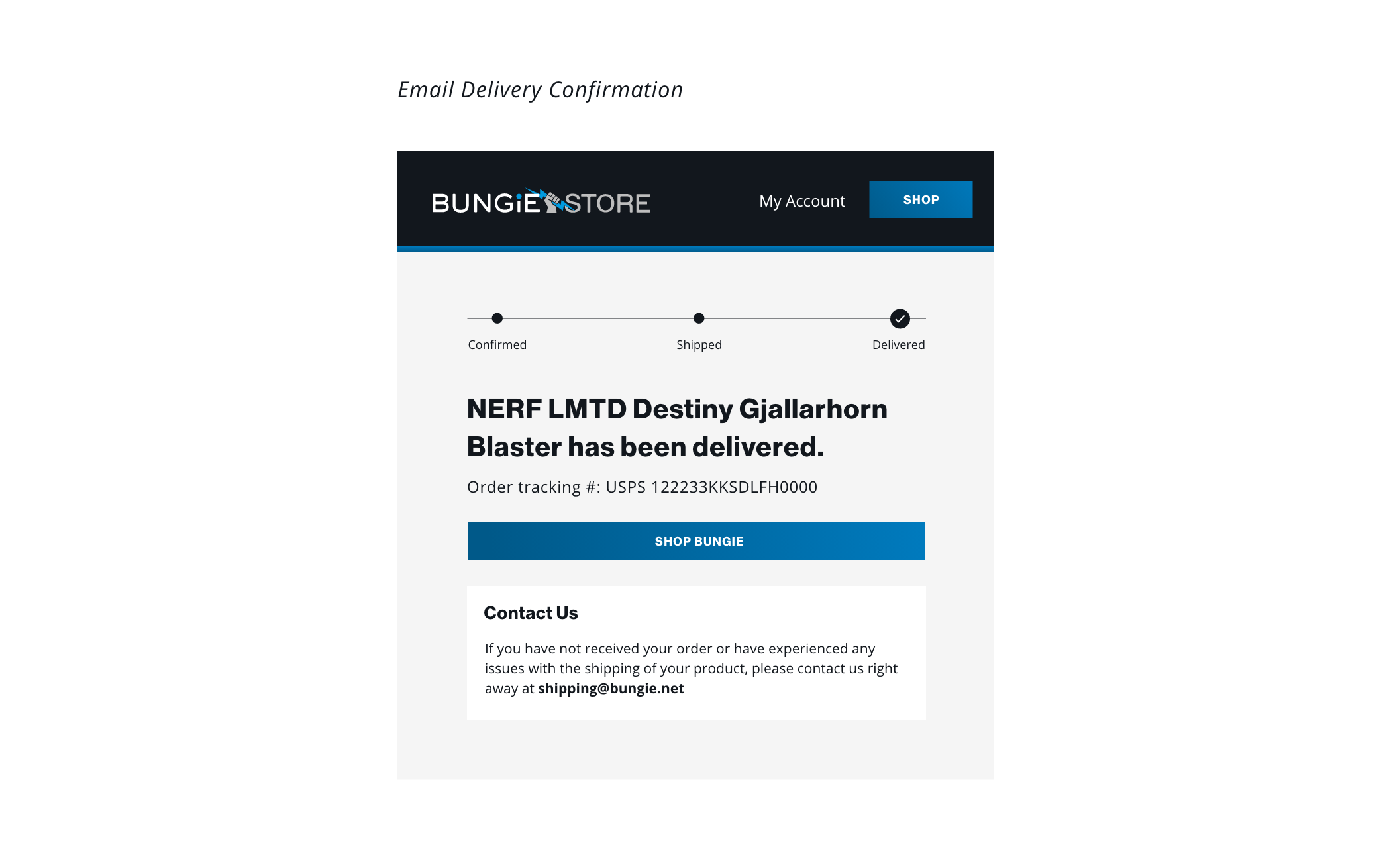
Email Pre Order - Delivery Confirmation