Union Pacific
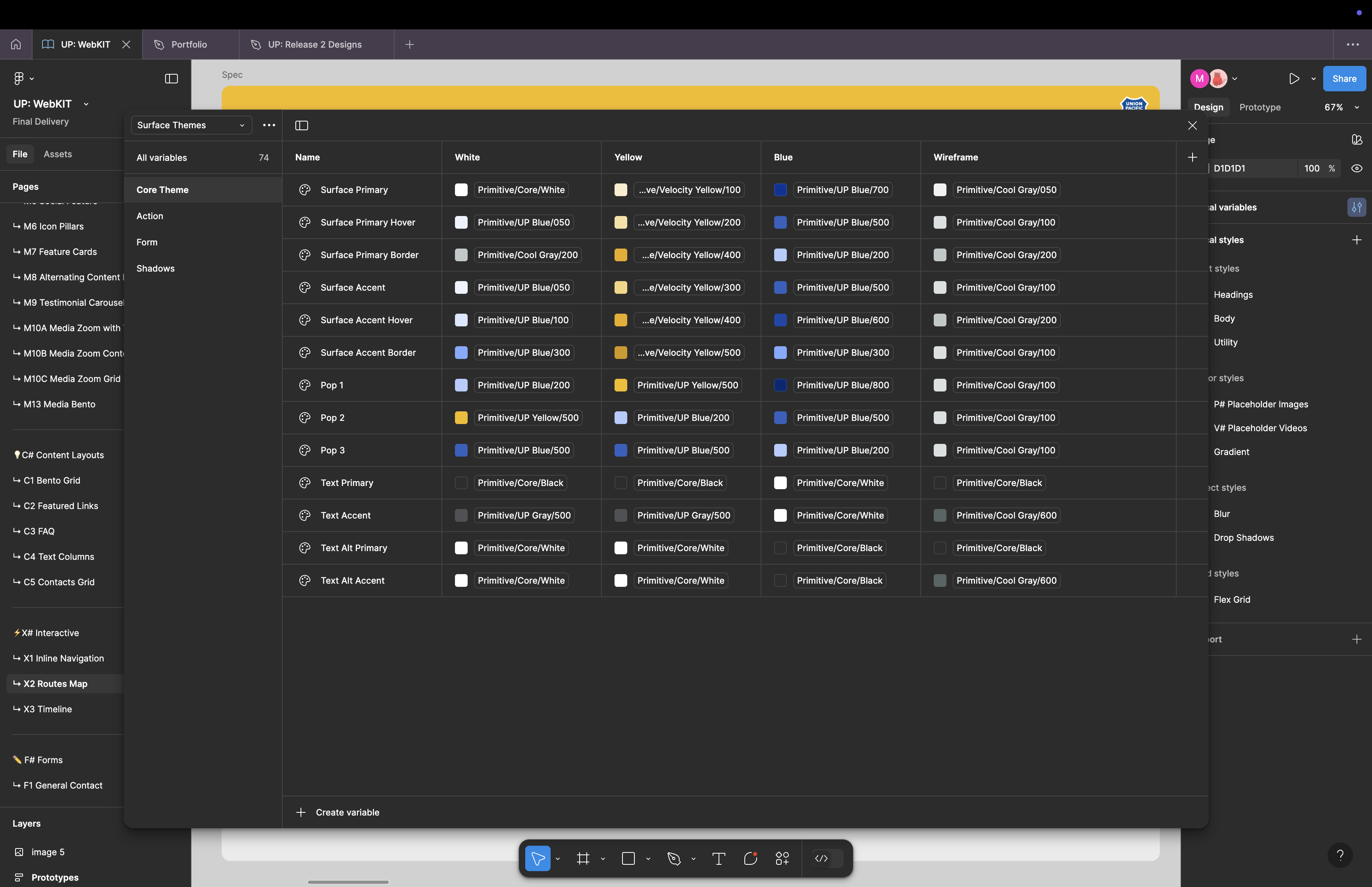
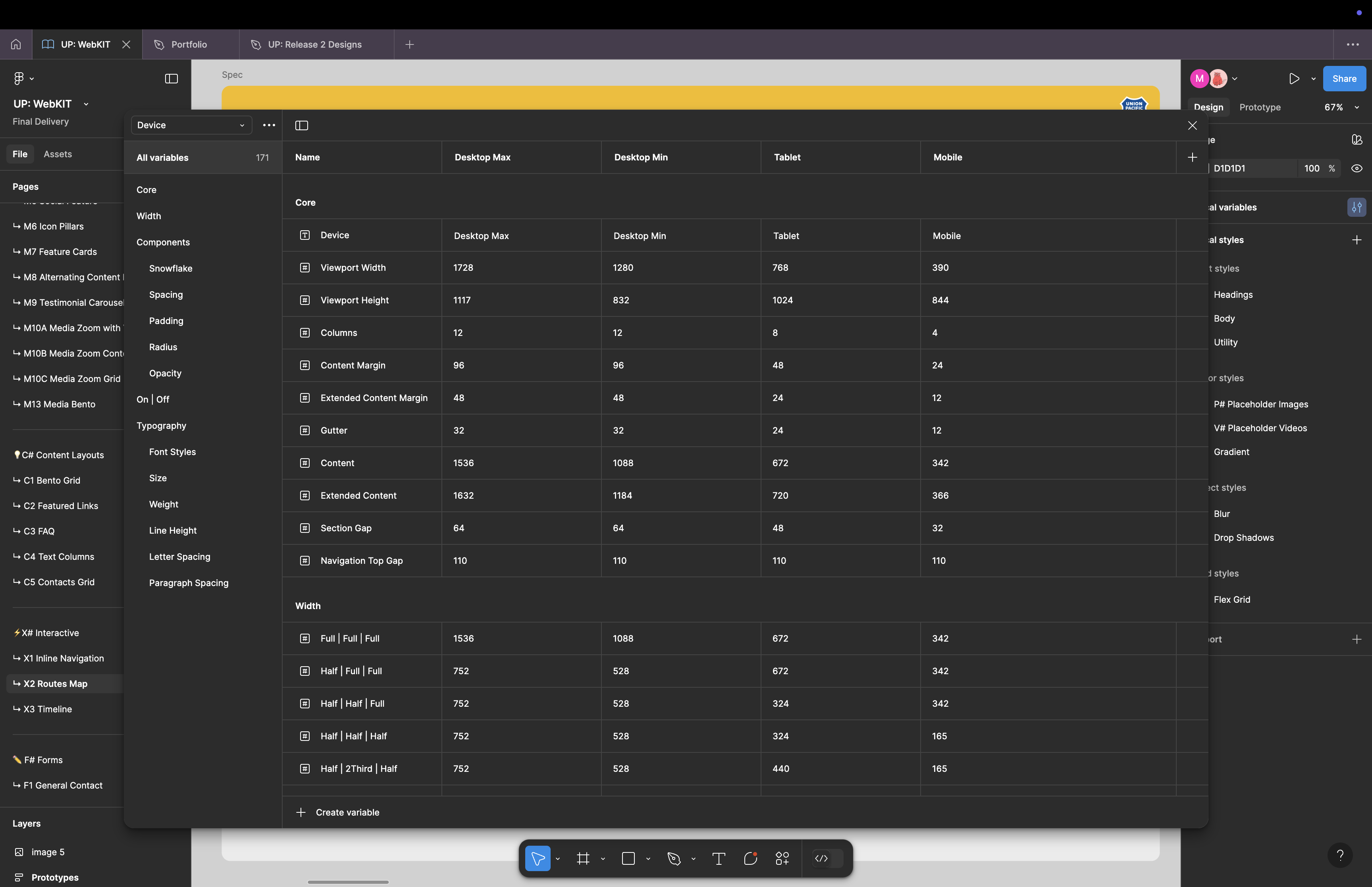
Union Pacific — one of North America's largest freight rail networks — needed more than a brand refresh. I led design on a custom build of up.com, replacing 10,000 pages of legacy Sitecore content with a 1,000-page system powered by 20 fixed page templates, one fully flexible template, and a from-scratch design system of 50 components. Built in Figma with variables and true responsive layouts so every token mapped 1:1 to dev. The system later became Globant's accelerator for enterprise rebuilds.
// Senior UX Design Lead @ Globant · Custom build (no Magento, no accelerator) · Sitecore → custom CMS migration · Design system productized as a Globant accelerator

No accelerator. No template. I led design on a fully custom rebuild of up.com — and turned the design system that came out of it into an accelerator Globant now uses for enterprise rebuilds.
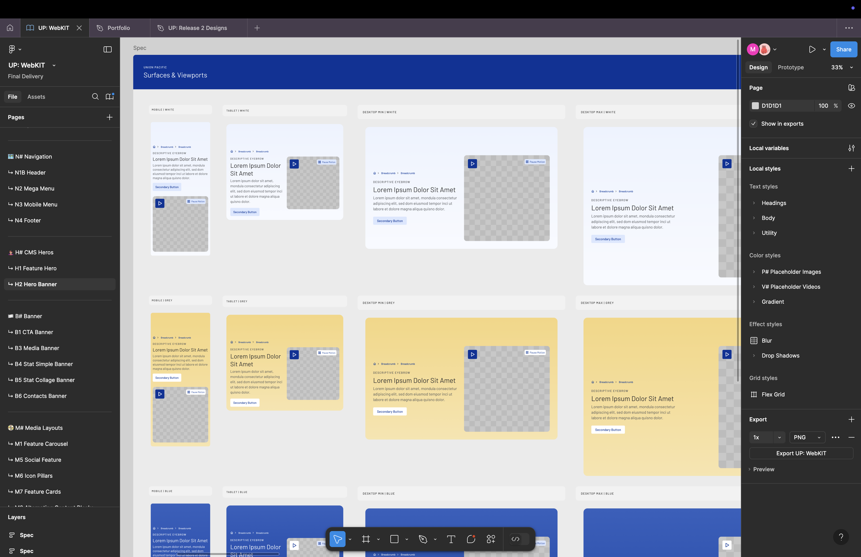
Union Pacific had a brand they hadn't grown into and a website that had drifted into 10,000 pages of legacy Sitecore content. The rebuild was end-to-end: a refined brand system, a from-scratch component library built in Figma with variables and one responsive variant per pattern, a custom CMS migration, and an information architecture that compressed the site to roughly 1,000 pages without losing what mattered. I led design throughout — from in-person stakeholder workshops at Union Pacific's Omaha headquarters to component QA before launch.
Design
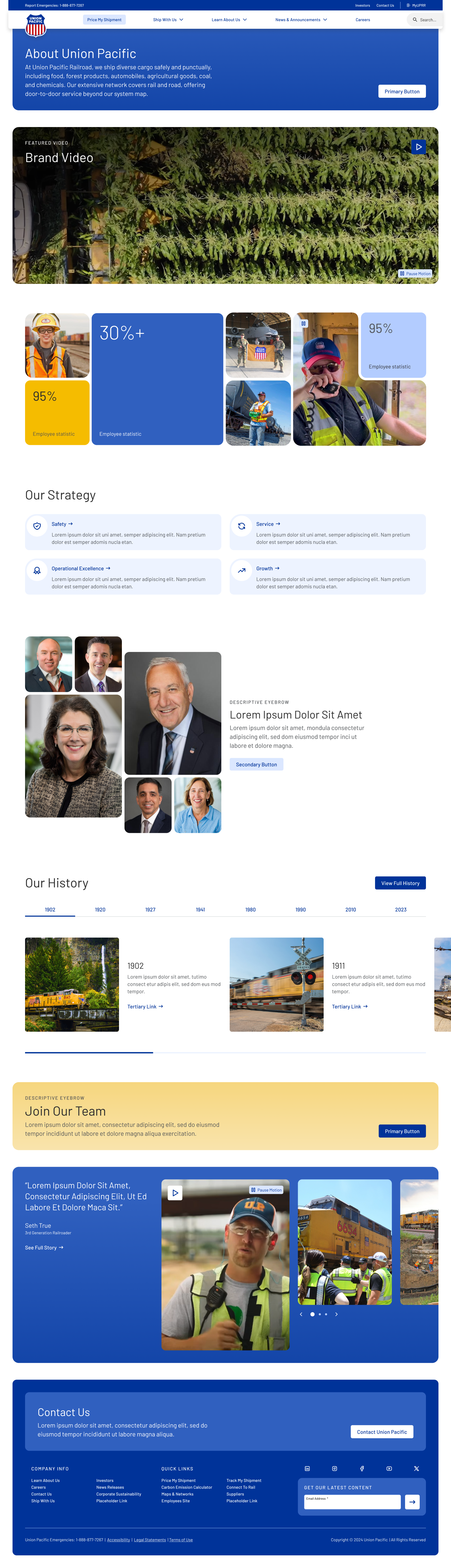
Homepage
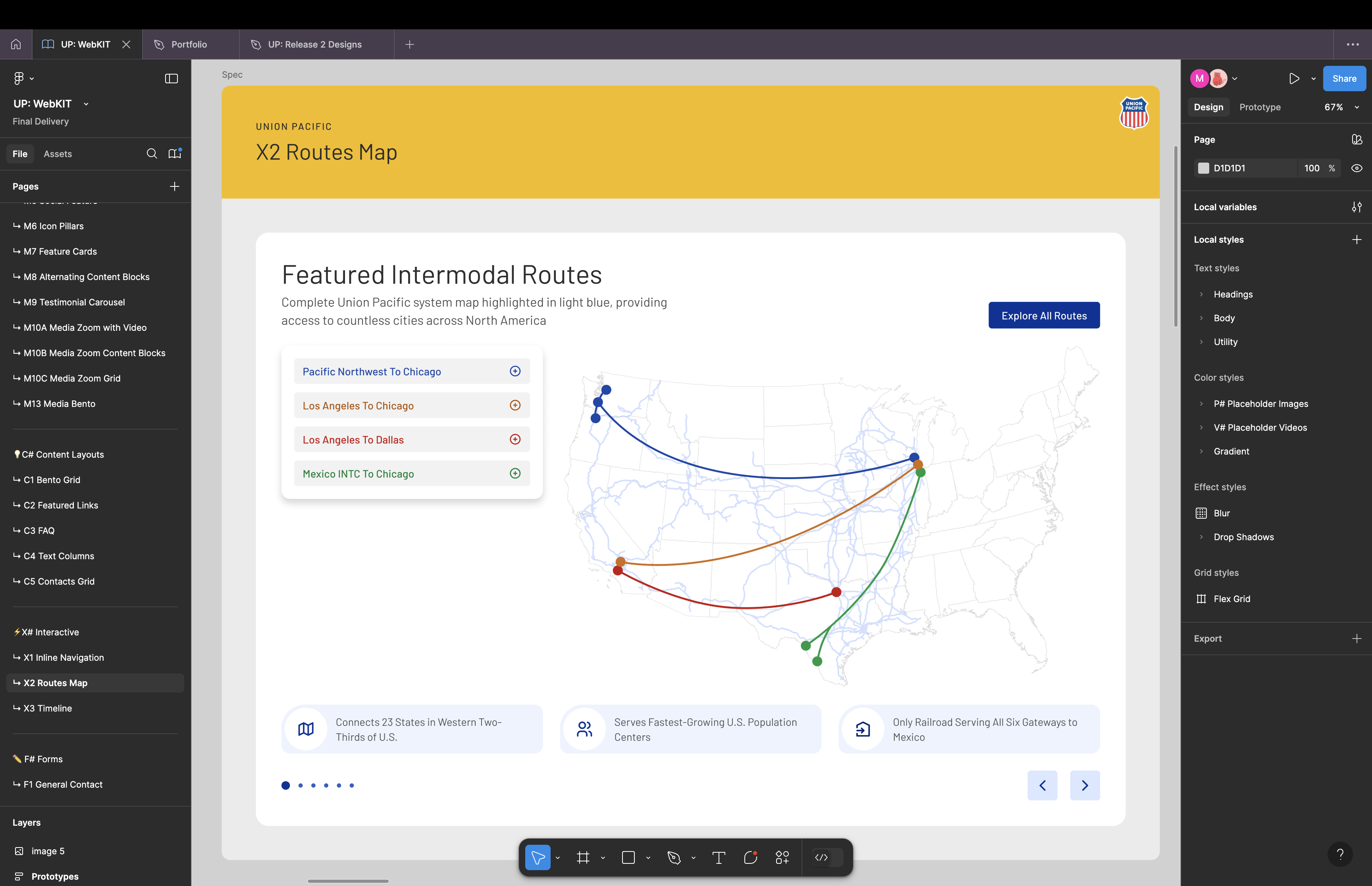
A customer-first homepage that surfaces shipping actions in the hero and tells Union Pacific's national-scale story below — built entirely from the new pattern library so every section reads as one cohesive system.

Design System
design
About Union Pacific

Challenge
Modernize the Brand Without Losing It. Union Pacific had a globally recognized identity, but the existing system was outdated and inconsistently applied. The work needed to feel current without breaking the recognition the brand had built.
Solution
I led the conceptual rebrand: same logo, same core palette, but a refined system of typography, spacing, motion, and component patterns that brought the brand into a modern era. The brand system and the design system were defined in parallel so they couldn't drift apart at scale.
Challenge
The existing Sitecore site had grown to over 10,000 pages — much of it duplicate, abandoned, or out of date.
Solution
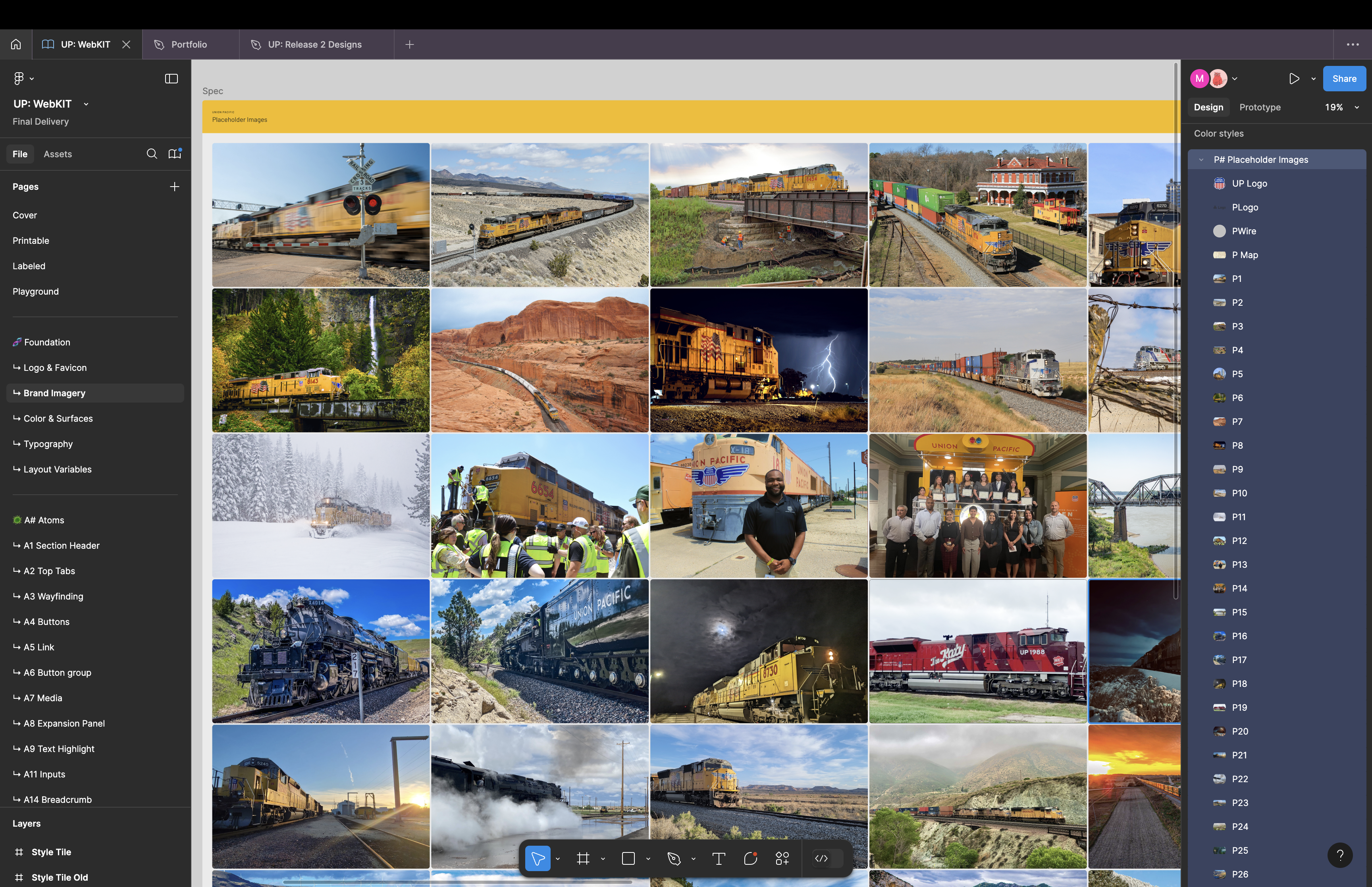
Working with the strategy team and Union Pacific stakeholders, I led the IA work that compressed the site to roughly 1,000 pages. We built 20 page templates for predictable content types plus one fully flexible template using the 50-component library, so Union Pacific's team could configure new pages without designer support. Sitecore migration was handled with a mix of automated tooling and manual placement, coordinated across design, dev, and content strategy.
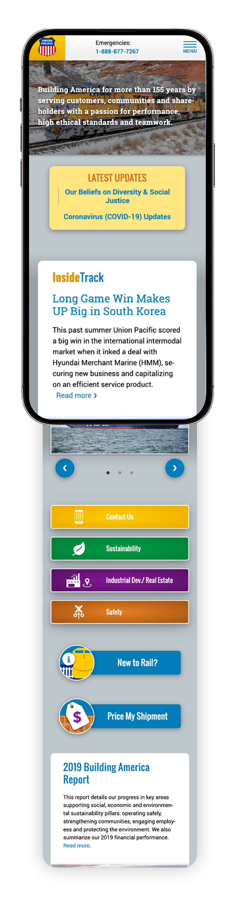
Before
News-article hero drowns out primary call to action
Customer tasks pushed below the fold by editorial content
A stack of 6+ colored CTA buttons diluted every primary action into competing noise
Legacy press-portal aesthetic — dense type, dated palette, no clear visual hierarchy
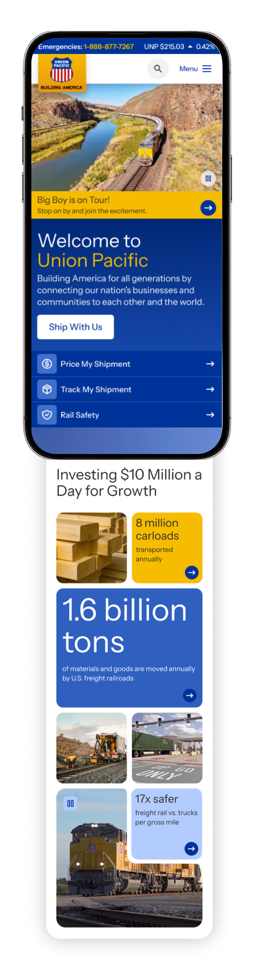
After
Welcome statement leads with what Union Pacific does for customers — one primary CTA
Customer tasks become the visual priority with three equal-weight cards
Single featured story slot keeps editorial without crowding tasks out of the hero
Scale told in headline-sized stats instead of paragraphs of body copy